Getting Started with CldImage
The CldImage component provides an easy way to deliver images from Cloudinary with the same experience you’d expect inside of a SvelteKit app.
With it comes access to more advanced features like dynamic cropping, background removal, overlays, and other Cloudinary transformations.
Basic Usage
The basic required props include width, height, src, and alt:
import { CldImage } from 'svelte-cloudinary';

<CldImage
  width={960}
  height={600}
  src="<Public ID>"
  alt="Description of my image"
  sizes="100vw"
/>
Note: A Cloud Name must be first be configured. See Installation for more details.
The sizes prop is optional but recommended for responsive sizing.

The src property takes in a Cloudinary Public ID which includes the folder path along with the ID of the image itself.
Transformations
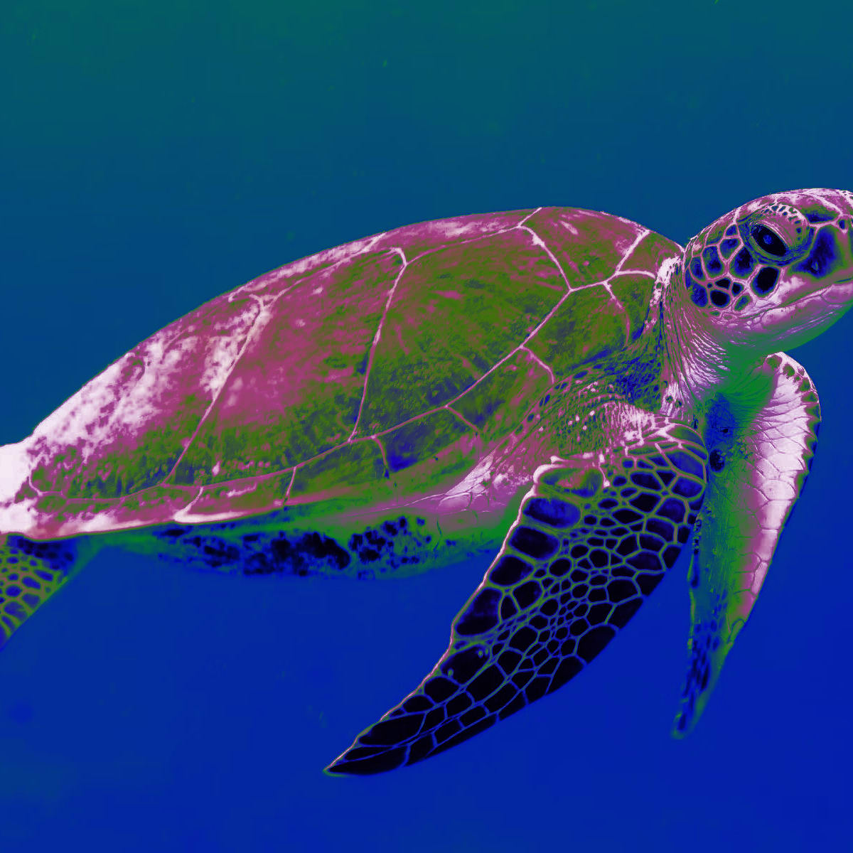
You can further take advantage of Cloudinary features like background removal and overlays by adding additional props:
<CldImage
  width={1200}
  height={1200}
  src="<Public ID>"
  crop="thumb"
  tint="70:blue:green:purple"
  alt="Description of my image"
/>
Using Cloudinary URLs
If using a full Cloudinary URL, you might already have transformations applied to your image.
To preserve those transformations, you can apply the preserveTransformations property:
<CldImage
  width={600}
  height={600}
  src="<Cloudinary URL>"
  preserveTransformations
  alt="Description of my image"
/>
Note: Cloudinary URLs must include a version number (/v1234) in order to be correctly parsed.